BRAND STANDARDS

Brand Overview
These brand guidelines were developed to provide the foundation for consistent application of the Academic Impressions brand across all media including:
- Web
- Advertising/Marketing
- Collateral/Sales
- Promotions
- Public Relations
Consistently expressing the Academic Impressions visual identity builds a strong brand awareness, allowing the brand to become the market leader. Please follow these guidelines for the most effective expression of Academic Impressions.
Logo Usage
The Academic Impressions logo should be used on all off-platform and off-site communication, including but not limited to:
- Advertising/Marketing
- Digital
- Marketing Collateral
Logos
Logo Configuration
Logo Configuration
The Academic Impressions logo is made up of both a symbol (square box) and type. These two elements should appear as shown in all corporate materials, including but not limited to web, advertising materials, collateral and sales materials, promotional materials, and public relations assets.
Logo Proportions
The Academic Impressions logo has been developed as a balanced whole and at no time may the shape, configurations, or proportions be altered. The correct proportions are shown here. Consistent use of the logo helps maintain the integrity of the brand and ensures greater brand recognition.
Placement
The Academic Impressions logo must always stand alone and may not be combined with any other graphic elements. It may not be less prominent than the most prominent third-party logo/ trademark appearing in the same area.


Logo Minimum Size
When the logo is reduced, there is a point at which it becomes ineffective. By establishing a minimum size for the logo, it is ensured that the logo is always prominent and readable.
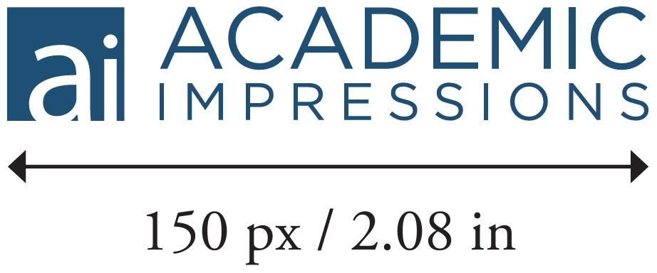
Academic Impressions Logo (horizontal)
This logo should never be reproduced smaller than 2.08 inches across (150 px) for the logo.
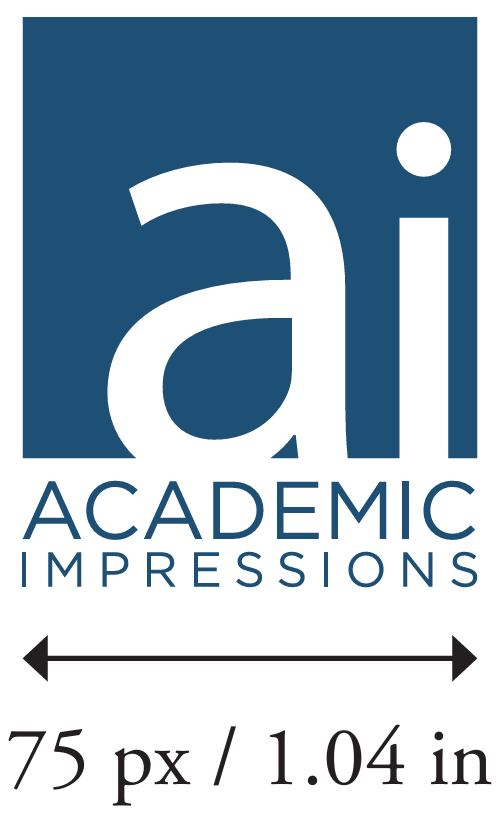
Academic Impressions Logo (stacked)
This logo should never be reproduced smaller than 1.04 inches across (75 px) for the logo.


Logo Reverse Treatment
If necessary, the entire Academic Impressions logotype may appear as a reversed white logo on black or a dark-colored background.
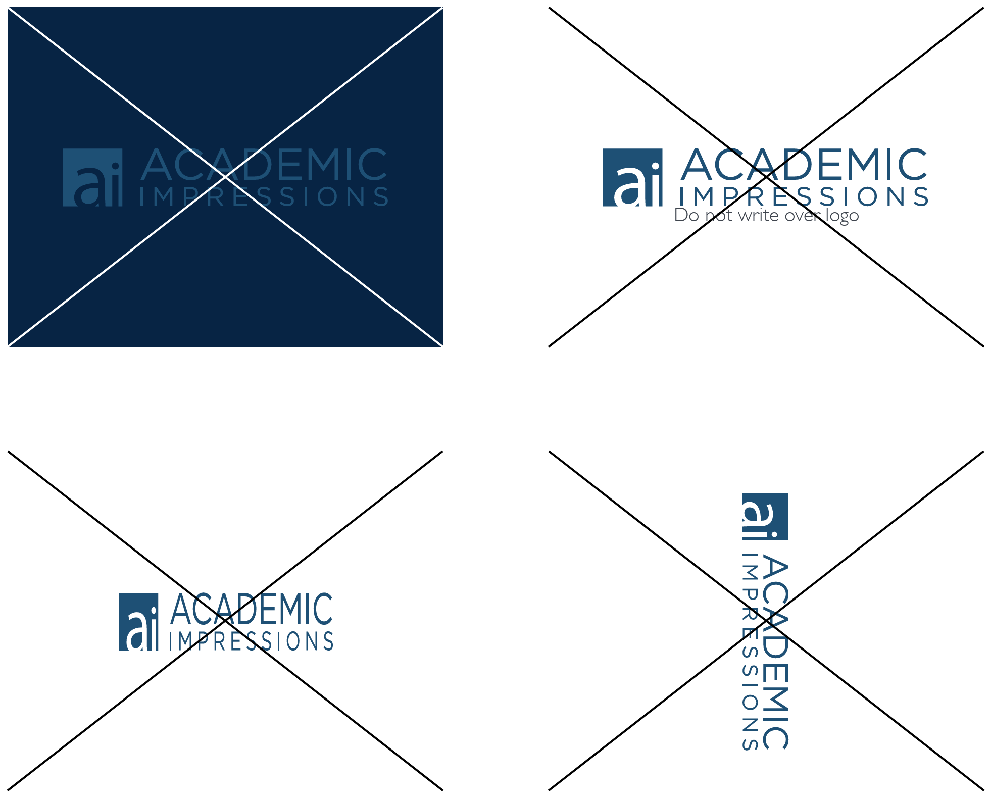
When reversing the logotype, be sure to maintain sufficient contrast. Generally, do not place the reversed version on a background that is less than 50 percent in value, and do not use the positive version on a background that is greater than 50 percent in value. Use your design judgment to determine which treatment will result in the greatest legibility.
Avoid complicated backgrounds that compete with the Academic Impressions logotype or reduce their legibility. If the Academic Impressions is superimposed on or dropped out of a photograph, it should always be placed on an area that has consistent background and sufficient contrast.


Logo Errors

Fonts
Open Sans Regular
ABCDEFGHIJKLMNOPQRSTUVWXYZ abcdefghijklmnopqrstuvwxyz 1234567890
Open Sans Bold
ABCDEFGHIJKLMNOPQRSTUVWXYZ abcdefghijklmnopqrstuvwxyz 1234567890
Open Sans Light
ABCDEFGHIJKLMNOPQRSTUVWXYZ abcdefghijklmnopqrstuvwxyz 1234567890
Color Palette
Logo Color
R32 G80 B117
C93 M69 Y33 K16
HEX #205075
Supplemental Color
R8 G37 B68
C100 M85 Y44 K47
HEX #082544
Button Color
R0 G117 B219
C82 M53 Y0 K0
HEX #0075db
Button Hover Color
R0 G78 B147
C100 M77 Y13 K2
HEX #004e93
Backgound Color
R234 G234 B234
C7 M5 Y5 K0
HEX #eaeaea
Background Color
R52 G54 B58
C72 M64 Y58 K53
HEX #34363a
