
How are states responding to a leveling off of demand for higher education from high school graduates? Here is a data dashboard to help you take a close look.
When Americans talk about our higher education systems, we point with pride to the wide diversity of offerings in the US. There are 7,000 post-secondary options that include colleges and programs offering certificates, or associate’s and bachelor’s degrees in wildly divergent fields such as auto mechanics, cosmetology, accounting, computer science, history, mortuary science, political science, chemistry, and welding. And these are offered at public, private, not-for-profit, and for profit institutions. When we look at this wide array of offerings, it seems that there is some program, somewhere, for almost everyone who wants to pursue additional education after high school.
But it is really the public institutions that carry most of the weight when it comes to educating students in the US. Just over 70% of the 20.3 million students enrolled in 2015, for instance, attended public institutions, and that percentage rises slightly when you consider only degree-granting institutions.
Access to high-quality, low-cost public education has been a hallmark of America since the end of WWII, when the GI Bill encouraged large numbers of returning veterans to enroll in college. Attainment rates soared: It’s almost impossible for most of us to imagine that in 1940, for instance, only about five percent of all adults had a college degree; that number was even lower for older people, and for women. By 2013, that percentage had soared to almost one-third of the adult population, fueled by government encouragement and investment, fear of Soviet dominance in space, increased access for women and people of color, and perhaps by the “Inheritance of Education” effect. Not only did college enrollments soar, but the number of institutions did as well, as the higher education market attempted to keep up with increasing demand.
But the population of high school students has peaked nationally, although there are some regional and local exceptions, of course. How are states responding to a leveling off of demand? Some data from the State Higher Education Executive Officers Association might help answer this question. (SHEEO does a more detailed dive on the data here.)
Looking Deeper
DIG INTO THE DATA
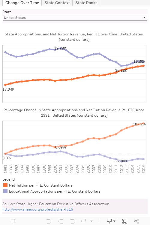
Note: This Tableau dashboard was prepared prior to Illinois’ long-delayed release of a state budget.
The dashboard above offers three views of the data.
VIEW 1: EDUCATIONAL APPROPRIATIONS PER STUDENT, AND NET TUITION
First, and most simple, is a national perspective on educational appropriations per student (in constant dollars, in purple) and a look at the net tuition that public institutions generate from students (in orange). It’s important to note that net tuition is not always funded by parent and student dollars; much of this may come from Pell or State grants or student loans, but these amounts count as net tuition since they come to the institution as cash.
After you take a look at national trends, use the filter to view any individual state. Check out Wyoming, Arkansas, North Carolina, and North Dakota as some exceptions to the general pattern. Then try Illinois, where the lack of a state budget has been pulling down the whole national average. (Note that this dashboard was prepared prior to Illinois’ release of a long-delayed state budget.)
In some sense, these trends parallel the economy, which in turn drives state revenues: Sharp declines in the aftermath of 9/11, a gradual attempt to rebound, and then a catastrophic drop after the financial crisis of 2007-2008. Some states are doing better than others at rebounding from the start of the recession that hit in 2008.
VIEW 2: EACH STATE IN CONTEXT
The second view shows the states in context, compared against each other. Choose a value: State appropriations per FTE, Net Tuition Revenue per FTE, or FTE Enrollment using the control at the top right, then select a state to highlight it in context. What you’ll see as you look at appropriations and scroll through the states, with a few exceptions, is consistency of position relative to the box plots defining the middle range of institutions: Vermont and Colorado are consistently near the bottom; Alaska is consistently near the top, and Florida is usually somewhere solidly in the middle. If past is prologue, you can see that few states have made bold moves over the last 25 years. A similar static trend holds for Net Tuition Revenue, and especially for FTE enrollment.
VIEW 3: RANKING THE STATES, OVER TIME
The final view shows a similar context, but ranks the states, regardless of the gap between rankings. The view starts with FTE Enrollment (which again, is fairly stable over time). Choose a state to highlight it in the rankings chart, or choose another variable to rank the states on. As always, hover over a point to see the details.
Conclusion
It has yet to be seen how fully and how quickly (if ever) the U.S. collectively and the states individually will recover from the recession that began almost ten years ago. Even if and when they do, it we will have to see how the financial crisis has changed the orientation of citizens toward state funding for education. Perhaps we’ve peaked, and Arthur Levine’s take on Higher Education as a “Mature Industry” will take its place as prophecy. Or perhaps some landmark occurrence will scare Americans into a renewed commitment to higher education funding.
For those of us who benefited both individually and collectively from booming educational attainment, which was itself brought about by the state’s commitment to public education, the current trends and the forecast of continued struggles should be bothersome. It’s hard to imagine America maintaining its place in the world economy if attainment rates fall against a backdrop of increasing complexity and increasing demand for more highly educated professionals.
READ MORE FROM JON BOECKENSTEDT
This article is part of our series Changing How We Understand the Market. In this series, we analyze current enrollment and demographics data, uncovering stories that challenge how institutions often understand their marketplace—or that shed new light on emerging trends. We want to encourage a deeper look at the implications of today’s marketplace data. We hope that you will share these stories across your institution and use them to start critical conversations to drive not only enrollment strategy but discussions of curricular offerings, student support, and course design. While we’ll highlight findings and stories worthy of closer attention, each article includes an easy-to-use Tableau dashboard that you and your colleagues can use to drill deep in the data yourself.
Here are three other popular articles from the series: