
Series: Changing How We Understand the Market
In this series, we analyze current enrollment and demographics data, uncovering stories that challenge how institutions often understand their marketplace—or that shed new light on emerging trends. We want to encourage a deeper look at the implications of today’s marketplace data. We hope that you will share these stories across your institution and use them to start critical conversations to drive not only enrollment strategy but discussions of curricular offerings, student support, and course design. While we’ll highlight findings and stories worthy of closer attention, each article includes an easy-to-use Tableau dashboard that you and your colleagues can use to drill deep in the data yourself.
Also in this series:
Yield Rates are Declining – Why?
Is the International Enrollment Boom a Rising Tide that Lifts All Ships?
How Simpson’s Index Can Offer Universities a Different Look at Diversity
Why Measuring Diversity Matters
The rise in undergraduate enrollment in the United States has been well documented and much discussed: Between 1980 and 2010, for instance, undergraduate enrollment rose almost 74%, far outstripping the growth (about 2%) in traditional-age college students in the US. There are likely several factors contributing to this surge, including economic growth; population growth; the belief in the value of a college degree; and the willingness of colleges to branch into new markets, such as older and/or returning students, and international students; and, to a lesser extent, some advances in technology that made distance education more available and more convenient to students.
Less has been written about graduate enrollment, and although its growth is less out-of-proportion to population growth in the US, the increases have still been dramatic: While the population of US citizens aged 25-39 grew almost 20% over the 30 years between 1980 and 2010, graduate enrollment growth in the US grew by almost 85%, and eventually, by 2014, by 90%. Like the trends with undergraduate enrollment, this trend is also likely due to a combination of several factors, not the least of which is the growth of offerings at American colleges and universities, where the MBA is virtually ubiquitous.
Dig into the Data
How to use this dashboard:
I’ve prepared a two-minute video tutorial showing how to navigate and drill deep into these views of the national data.
Troubleshooting:
Note that the filters can’t be in conflict. So, for example, on the third tab, if you choose New England in the BEA regions, you will not be able to select Texas in the states. If you get no results, you probably have a conflict there. This can also happen if you select private institutions and then try to find Wyoming under states, as there is no private graduate enrollment in the state.
If you find yourself stuck as you drill into the data, use the Reset button on the dashboard to take you back to the default views.
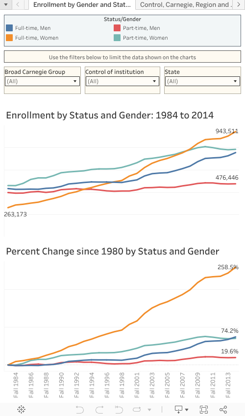
First Tab: Rapid Growth in Graduate Enrollment of Women
If the big picture of this is growth in size, the smaller picture shows us changes in shape and composition. While the first tab in the Tableau dashboard (above) allows you to drill and dig into the data in almost limitless permutations and combinations, one of the most compelling trends is obvious on the first view: In 1980, full-time women made up the smallest group of graduate students, at about 17% of all those enrolled; by 2014, that percentage of total had almost doubled, to almost 32%, and represented the largest single group of students, when measuring gender and enrollment status in combination. The fastest shrinking segment was part-time men, whose fortunes were a virtual mirror image of the full-time women.
This is true whether you look at Doctoral, Master’s, or Baccalaureate, or Medical Schools, using collapsed 2010 Carnegie Classifications (note: there are some Associate’s Colleges that offer graduate degrees, but the number of degrees awarded is fairly small). And it’s true regardless of control: Public, Private, and For-profit institutions all show variations of the same trend (and because for-profit graduate degrees were virtually non-existent in 1980, the percentage growth is astronomical in that sector.)
You can also look at individual states (alone, or in combination with other variables); what seems interesting is the sameness of the pattern. In all but a handful of states, full-time women now represent the single largest group of graduate students. In almost all of the states where this is not the case, enrollment of full-time women is second to enrollment of part-time women.
Second Tab: Drilling Down Further
Moving to the second tab, you can view how the shape of graduate enrollment has changed over time, looking at four variables:
- Total enrollment by institutional control
- By broad Carnegie type
- By Bureau of Economic Analysis region
- By a combination of gender and enrollment status
Use the controls to cycle through the years one-at-a time, or grab the circular slider at the right and fly past 30 years at once, if you wish.
What you’ll see is interesting:
- On the top left (red) chart, note the rise of for-profit institutions.
- On the blue chart at upper right, the diffusion of enrollment away from traditional doctoral universities and towards Master’s and “Other” institutions (mostly specialized, highly focused institutions).
- On region, the shifts mostly move in the same way that the US population has moved: away from New England, the Middle Atlantic, and Great Lakes states, and toward the Southeast and Southwest.
- And, as mentioned before, the lower right (orange) chart shows how women have become the majority of enrolled graduate students, and full-time women the plurality.
Third Tab: Custom Views
The final tab gives you the freedom to compare enrollment over any two years, showing the beginning and end year enrollments and the percentage change. You can look at Collapsed Carnegie Groups, Control, State, Region, Enrollment status, and gender. This allows simple comparisons: For instance, to compare growth at public institutions, private not-for-profit, and for-profit institutions, to see both numbers and percentage change. Some of these comparisons yield data that seems surprising, others less so.
You can also drill more deeply into this data if you wish. For instance, try the years 1997 to 2007, for Public Doctoral institutions in California, focusing on full-time men. You’ll see enrollment rose by just under 3,000, or about 14%, over that time.
If you just want to look at your institution, or a competitor institution, you can do that as well, using the Single Institution control. Because some colleges and universities share names, I’ve added the state to the descriptor to make it easier to make sure you’re looking at the right institution. Use the drop down in the traditional way, or start typing a name in the box to limit the choices first.
Here, differences in institutional strategy and market realities may come into play. It’s clear that different institutions have taken very different approaches to the increased demand for graduate education over the past 35 years. Over the full 34 year view, Georgia Tech increased graduate enrollment by a whopping 357%; Harvard almost doubled its graduate student body; DePaul increased by 56%; and UC Berkeley by just 7%.
Looking Ahead
I think the big story here is the rise in attainment and attendance of women. This trend, of course, should not be surprising to anyone interested in educational data in the US. As you can easily see on my blog, Higher Ed Data Stories, women have been outperforming men for a while in this country.
The logical next step is to ask what the future holds. While past is prologue, a data visualization such as the one provided above can’t answer that question just yet. It can, however:
- Serve as a prompt for discussion on your campus about how the current state was or wasn’t predictable, based on the changing shape of the American population and the constantly shifting economy
- Provoke you to analyze how well your institution has adapted to these changes as they occurred
- Drive you to ask questions about the shifting trends and the years ahead, from either a fatalistic or an opportunistic perspective
The fatalist will look at programs that have historically had high appeal to men and wonder if those programs are doomed, and may ask whether your institution should look at opening entirely new colleges or programs that may appeal more to women.
The opportunist will ask whether you need to adapt your existing programs to be more open and welcoming to women in the first place.
And the historians and philosophers on campus might argue that the programs in question have already changed (or begun to change) in response to shifting enrollment, suggesting that your job is to anticipate the next big change, still nascent and barely visible on the horizon.
Many of those future trends might not be demographic, of course, and could therefore be harder to spot. Geography, politics, economics, and social factors will all come into play in the future, as they have in the past. The point is to start asking these questions so that we do not remain in a primarily reactive position.
Where This Data is From
This dashboard has been constructed using data from tables and graphs at: