
This is one of two companion articles that form a dual installment in our “Changing How We Understand the Market” series. The companion article to this one is “Why Measuring Diversity Matters” by Ricardo Azziz.
In this series, we analyze current enrollment and demographics data, uncovering stories that challenge how institutions often understand their marketplace—or that shed new light on emerging trends. We want to encourage a deeper look at the implications of today’s marketplace data. We hope that you will share these stories across your institution and use them to start critical conversations to drive not only enrollment strategy but discussions of curricular offerings, student support, and course design. While we’ll highlight findings and stories worthy of closer attention, each article includes an easy-to-use Tableau dashboard that you and your colleagues can use to drill deep in the data yourself.
If you were to poll a cross section of faculty and staff at colleges and universities today to determine the topics most frequently discussed, it’s likely diversity would be among those at or near the top of the list. Yet even people who are in agreement about the benefits of diversity are often at odds when it comes to defining the term. Typically, we return to traditional measures of ethnicity as a basis for the discussion, and there are good reasons to do so: Colleges must report enrollment statistics by gender, race/ethnicity, and level (graduate or undergraduate).
Yet “diversity” extends beyond the genotypes and phenotypes of race and ethnicity and gender, requiring attention to other important factors such as socioeconomic status, parental attainment of undergraduates, and residency. Without mandated reporting of these variables (either alone, or in conjunction with other measures), it can be difficult or impossible to garner any industry-wide insight.
Finally, the traditional measure of diversity (the percentage of students from underrepresented ethnic and racial groups) is flawed in another, important way. While HBCUs and Hispanic-serving institutions, for instance, enroll large percentages of students from these groups, they also are not very diverse in a clinical sense. For example, at an institution with an enrollment that is 90% African American, most students share ethnicity.
But just looking at ethnicity alone, scientists have come up with many ways to measure the diversity of complex systems, and one of the most common is Simpson’s Index (D).
This index calculates the probability that any two members of the system, selected randomly, will be the same. Since lower numbers translate into higher diversity, many scientists subtract D from 1 (that is, 1 – D) to get a more meaningful number that represents the probability that any two members will be different. This allows you to place a particular institution on a scale from 0 (absolutely no diversity) to 1 (complete diversity, wherein every member of the group is different). While limited in terms of what it can measure, this index can be used to compare regions, states, types of colleges, or individual institutions.
Below, you will find:
- An interactive Tableau dashboard that applies Simpson’s Index to data from IPEDS and the US Census Bureau, with instructions below on how to use the tool to mine national data.
- Commentary from three experts on diversity and enrollment management (Jon McGee, Sundar Kumarasamy, and Ricardo Azziz), focused on what the tool demonstrates and what the tool’s drawbacks are.
1. An Interactive Tool
SIMPSON’S INDEX
As always, I offer the usual caveats about IPEDS data: there may be manual data entry errors, misinterpretation of data definitions, and occasional missing data.
How to use this dashboard:
I’ve prepared a two-minute video tutorial showing how to navigate and drill deep into Tableau views.
Exploring 5 views:
This month’s Tableau is interactive, and allows you to pare down the information to look at only the data that is most interesting to you. Use the tabs at the top to navigate between these five views of the data:
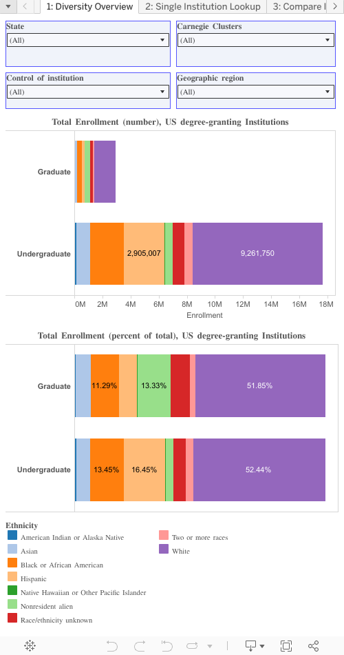
- Tab 1: Diversity Overview.
This tab measures diversity at the top level: All enrolled graduate and undergraduate students in the US in Fall, 2014 at just over 7,000 institutions, and uses traditional measures, showing just the total number of enrolled students at the graduate and undergraduate level, and the percentage of totals they represent. Use the filters to select a subset of institutions, but state, region, control, and broad Carnegie type. - Tab 2: Single Institution Lookup.
This tab shows the same data as the first tab, but for any single institution. We’ve randomly selected MIT as the first institution, but you can select any other college using the filter at the top. Note that in addition to the breakouts, we’ve displayed two different ways of calculating Simpson’s Diversity at the bottom: The gray bar excludes “ethnicity unknown” from the population; the red bar includes it. For MIT, the large percentage of Nonresident alien students at the graduate level means graduate programs are less diverse. - Tab 3: Compare Institutions.
Select multiple colleges to compare to each other (choosing eight or fewer gives the best viewing experience). We’ve started by displaying the eight Ivy League universities, but you can customize your set any way you’d like, and you can specify the graduate, undergraduate, or both. - Tab 4: Comparing States and Institutions.
This tab ranks the states on two variables: The diversity of the population aged 17-25 (thick orange bar), and the diversity of enrollment in that state (thin blue bar). A value of 1 shows the highest diversity, using the Simpson’s Index. If the orange bar is longer than the blue bar, (like New Mexico) it means the educational system ranks higher in diversity than the population does; when the blue bar is longer (like Delaware) it means the state ranks higher in diversity than the educational system does. What’s interesting, I think, it the small levels of variation in the two ranks. - Tab 5: Diversity by Region and Type. This breaks the world of higher education into 32 pieces, by region and broad Carnegie type, and calculates the weighted Simpson’s Diversity for that segment. You can choose the value to display, using the parameter at the top: Using only US citizens with known ethnicity; using all enrollment with known ethnicity (including international); or using all enrollment excluding “unknowns” but including international students.
These data can help you put things into perspective, but can also reinforce that there is no one, single, best way to look at a topic as complex as diversity. Start by putting the raw numbers and percentages into some context, to see what our overall educational system looks like. Then drill down to your institution, and learn that Simpson’s Index can help you see these numbers differently. Move on and put yourself in context, using your peer and overlap (or maybe your aspiration institutions) into some context. If you like what you see (and especially if you don’t), use the industry rollups by state, by Carnegie Type and by region to ground yourself.
2. Higher-Ed Leaders Weigh In on Simpson’s Index
We asked three experts on the issue of ethnic diversity and enrollment management to weigh in on what Simpson’s Index demonstrates, as well as its drawbacks.
Jon McGee
Vice President for Planning and Public Affairs,
College of Saint Benedict/Saint John’s University
The Simpson’s Diversity Index provides a useful, though limited, lens through which to understand our changing student bodies. It allows for apples-to-apples comparisons within the limits of what it measures (in this case race and ethnicity). Those comparisons can provide valuable additional context to discussions with trustees, faculty and staff and alumni.
But we need to think carefully about what this metric means and doesn’t mean. Practically speaking, race and ethnicity is not particularly well captured by current counting conventions on most campuses, and certainly not in IPEDS reporting. Broad racial categories don’t capture significant and important cultural distinctions among sub-populations. At my institutions, for example, female Asian students are quite likely to be Hmong, a still relatively new and culturally distinct immigrant population. Our male Asian students are not as likely to be Hmong. The distinctions matter in terms of cultural context (and the way culture shapes the experiences those students will have).
All colleges have a predominant set of student characteristics – a kind of modal student (often found giving tours for the admission office). But what happens when the market or the world around us changes? How do we think about, understand, and plan for that change on campus, not just in recruitment terms but in terms of the campus learning experience? Ultimately, our challenge as institutions is to understand those changes in the context of the experiences we provide. We need to know the multi-dimensional ways our student profile is changing and then move quickly to understand what those changes mean for our students and for institutions.
Sundar Kumarasamy
Vice President for Enrollment Management,
Northeastern University
Whether we use miles, kilometers, centimeters or millimeters to measure, the real distance is never going to change. In my opinion, that is similar to measuring diversity using Simpson’s Diversity Index. According to a Georgetown Center on Education and the Workforce report, between 1995 and 2009, 82% of new white enrollments have gone to the 468 most selective colleges. But during the same time frame, 72% of new Hispanic enrollment and 68% of new African- American enrollment have gone to the two-year open-access schools. This percentage is the number that needs to be measured and managed to change the two separate pathways that will continue to perpetuate an intergenerational socioeconomic divide.
Ricardo Azziz
Former President,
Georgia Regents University & Georgia Health Sciences University
While the dashboard has clear drawbacks (e.g., it uses a few markers of race and ethnicity as measures of diversity, uses IPDES data, focuses solely on students, and does not assess faculty or staff), the tool clearly demonstrates the value of having data that can be manipulated across institutions and beyond.
For example, one clearly is able to see such national trends as:
- That most student populations at institutions of higher ed are more diverse than their state populations. Those institutions that are not should take notice and ask why not.
- That universities in less diverse states are generally also less diverse than the norm, which affects their students’ on-campus experience and likely helps ensure that discrimination and cultural intolerance persists in these states.
- That public universities are more diverse than private non-profits, but much less diverse than private for-profits, a fact that likely reflects the access mission of public higher ed and the business model of the for-profit sector. And so on.
However, the real value of such a dashboard is the ability of leadership of an individual institution to benchmark against national trends and compare with other institutions, thus helping to guide the development of strategy and the monitoring of tactical implementation. While the dashboard offered by Jon Boeckenstedt is but an example, it does highlight the possibilities — and the absolute need to measure if we want to actually improve our campuses’ diversity, inclusivity and tolerance. (Read more of Azziz’s analysis here.)